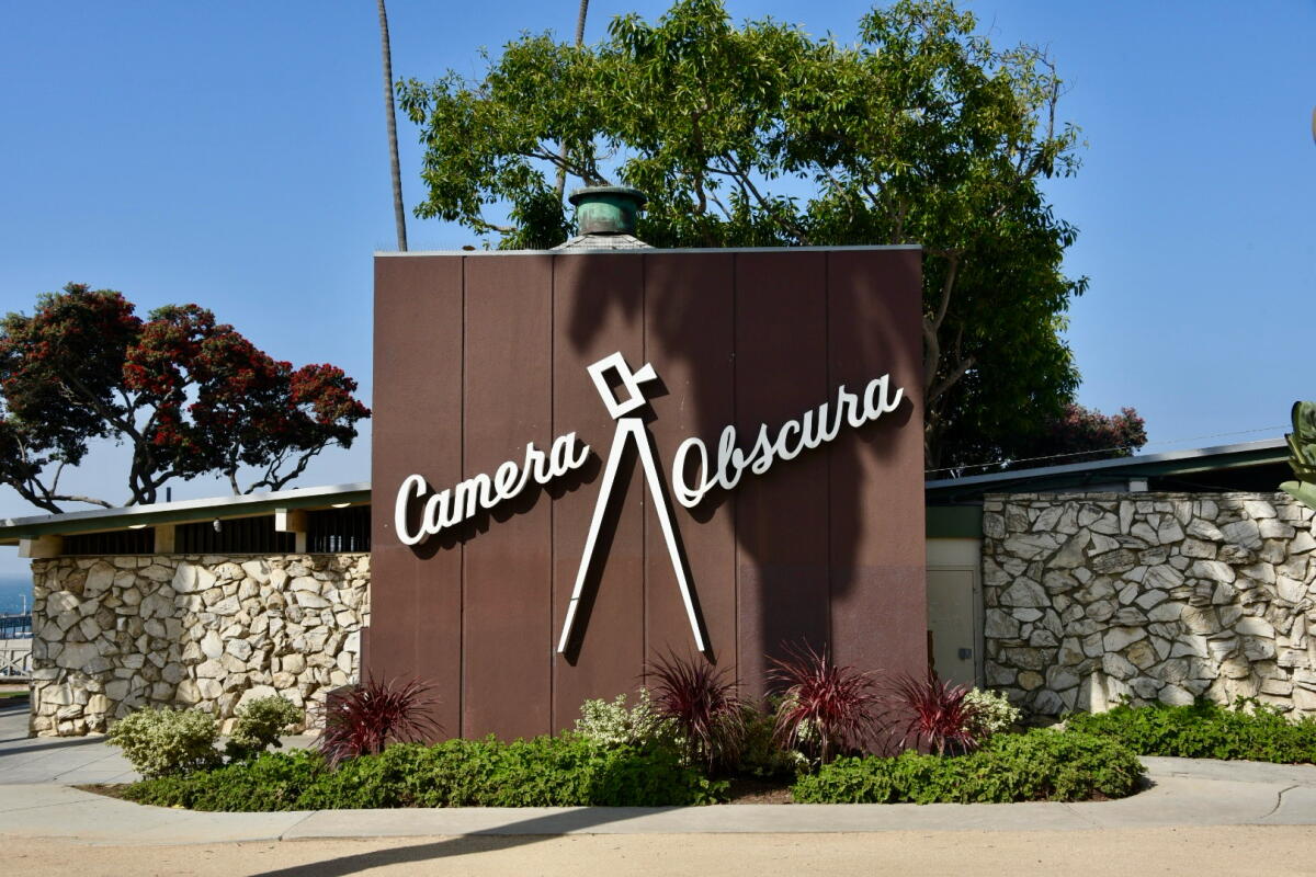
The letters often climb up, up to the end of the word, pointing toward a space-age future. They can be found on the midcentury signs still standing tall in our urban landscape, many of which were written in cursive.
“The script perfectly reflects the optimism in midcentury design,” said Kathy Kikkert, author of “Hollywood Signs.” “You can just see a rocket underneath the typography, zooming off into the future.”

Santa Monica’s Camera Obscura was designed by architect Weldon J. Fulton.
(Keith Plocek)
You can find cursive on the Camera Obscura and other buildings designed by Weldon J. Fulton in Santa Monica. Moving inland, you can see connected letters on Paul R. Williams’ Crescent Wing of the Beverly Hills Hotel. Keep going, up, up, and you will discover looped script on the signs for Patys Restaurant in Toluca Lake and the Safari Inn in Burbank.

The circa-1960s diner Patys in Toluca Lake.
(Keith Plocek)
“The script is often on a slant, and that adds a very artful energy to it,” said Alan Hess, who has written extensively on postwar American architecture.
Cursive signs aren’t unique to midcentury architecture, and not all midcentury signs featured cursive — far from it. But the combination happened often, and some of those signs still remain, reminders of a future that is now past.
There’s cursive on Rae’s in Santa Monica, Johnie’s in Miracle Mile and Bob’s Big Boy Broiler in Downey. Many a liquor store has looped letters, adding a touch of class to the booze trade. And let’s not forget the midcentury motels with their electrified names.
“Neon was the perfect material for script signs,” said Hess, “because you could have all of these curves.”
The signs were often designed to be visible from inside cars, attracting attention — and serving as landmarks — from blocks away.
“The 20th century city was scaled to the automobile,” said Hess. “You had to be bigger, bolder.”

Bob’s Big Boy in Downey retains the cursive “broiler” script.
(Keith Plocek)
Hess is an architect and historian who has been very active in preservation. When asked about cursive signs, he eulogized the big Sears sign at Valley Plaza, a North Hollywood shopping center that was demolished last year. The script was enormous, he said, and beautiful and flowing. Unveiled in 1951, the script became an urban feature in that part of the Valley. It was also very effective as a sign, he said, “pointing people in the parking lot to where Sears was.”
One of the main features of midcentury commercial architecture, especially Googie, was the way the signs were incorporated into the overall design.
“The sign is architecture,” said Hess. “Architecture is the sign.”
Both Hess and Kikkert see a connection between the cursive on the signs of that era and the flowing script in the credits of many Hollywood films.
“Every architect went to movies,” said Hess, adding that everyone who designed credits for those movies probably lived in Los Angeles and saw signs along the roads. The influence would have gone both ways.
Cursive was prominent in movie trailers too. “I am thinking of the trailers for noir films,” said Kikkert. “Thrills! Chills! They used script in a lot of those.”

The iconic cursive script on the Beverly Hills Hotel was crafted from the handwriting of Paul R. Williams, hired in the 1940s to redesign the property.
(Keith Plocek)
Many of us don’t write much by hand anymore, and fewer still write in cursive. That immediate sense of individuality is going away, along with some of the older signs lining our streets.
Alex Mebane began researching Westside signs in 2004, and many of the examples had disappeared by the time he published the book “Signs of Santa Monica” in 2020. The cursive on midcentury signs reminds him of handwritten correspondence from the past.
“I have a friend who lost his house in the Palisades fire, and he had some really nice things,” said Mebane. “What he missed were letters that his parents had written him, and they were in cursive, because that’s the way people wrote.”
During his research for the book, Mebane noticed that cursive was sometimes used to stylize the name of a company while the actual purpose was written more plainly. Two examples that still stand are Michael’s Liquor on Wilshire and Bourget Bros. Building Materials on 11th. The first half of those signs are cursive, while “liquor” and “building materials” are all business.
Using cursive to elevate the mundane was a technique well-known by designers of dingbats, the boxy apartment buildings that popped up all over Southern California in the 1950s and 1960s. Many of those buildings are adorned with ornate lettering.
The cursive writing adds a sense of elegance, said Kikkert. “You’re coming to home to this real rectangular shaped building, but then you see the script just thrown across so casually, and it just feels welcoming.”
We don’t know who designed the script on most of those apartment buildings, along with the other midcentury signs that survive. The artists are anonymous, and all we have are the traces of their individuality.
“Sometimes it’ll be somebody at the architecture firm,” said Kikkert. “Sometimes it’ll be somebody at the sign company. It’s lost to history in a lot of cases.”

The Montana Branch Library in Santa Monica.
(Keith Plocek)