recent month

Young immigrants face concerning conditions at Texas site, lawyers say

Nearly 600 immigrant children were held in a Texas family detention center in recent months without enough food, medical care or mental health services, as their time inside stretched beyond court-mandated limits, according to court documents.

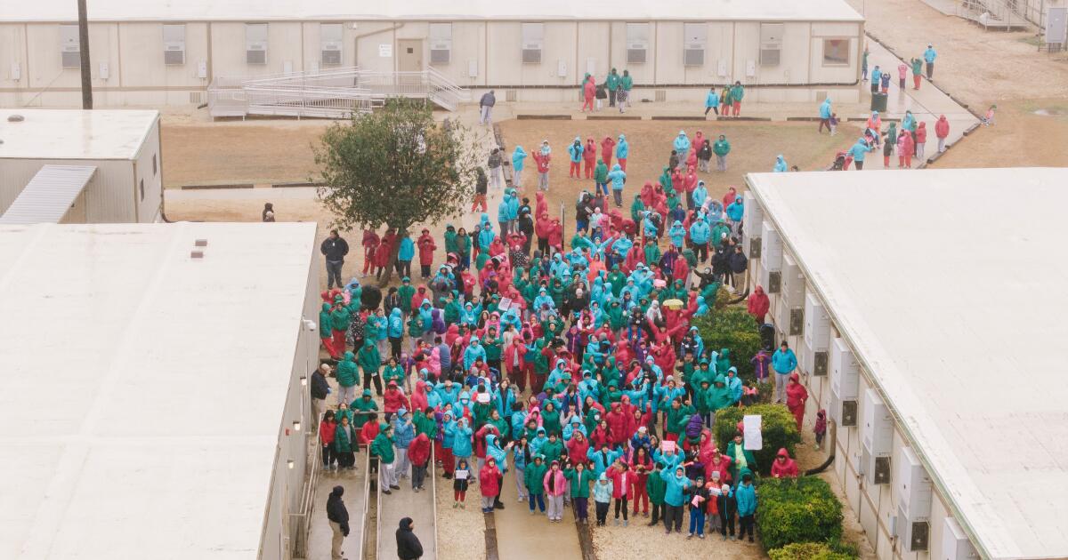
Children and families held at the detention facility in Dilley, where 5-year-old Liam Conejo Ramos and his father were sent this year, also faced virus outbreaks and lasting lockdowns in December and January, although the total number of children held there has fallen in recent weeks, according to the attorney reports and site visits.

The case of Liam, a preschooler who was wearing a blue bunny hat and Spider-Man backpack when he was picked up in Minnesota by U.S. Immigration and Customs Enforcement agents, stoked protests over the Trump administration’s immigration crackdown, including among detainees who gathered and held up signs in the yard behind the Dilley facility’s chain-link fences.

Last week about 85 children remained detained at the Dilley facility, but concerning conditions continued, said Mishan Wroe, directing attorney at the National Center for Youth Law, who visited in mid-March. In early February, a legal advocate for the children observed about 280 children.

The filings Friday cited numerous poignant cases, including that of a 13-year-old girl held at Dilley who tried to take her own life after staff withheld prescribed antidepressants and denied her request to join her mother, as reported by the Associated Press. The government reported there had been “no placements on suicide watch,” according to the filing. The AP obtained Dilley facility discharge documents that described a “suicide attempt by cutting of wrist” and “self-harm.”

The filings were submitted in a lawsuit launched in 1985 that led to the creation in 1997 of court-ordered supervision of standards and eventually established a 20-day limit in custody. The Trump administration seeks to end the Flores settlement, as it is known.

“For years, the Flores consent decree has been a tool of the left that is antithetical to the law and wastes valuable U.S. taxpayer funded resources,” the Department of Homeland Security said in a statement. “Being in detention is a choice.”

Attorneys for detainees highlighted the government’s data showing longer custody times for immigrant children, and also cited worms in food and poor access to medical care or sufficient legal counsel as reported by families and monitors at federal facilities.

“Dilley remains a hellhole,” said Leecia Welch, the chief legal director at Children’s Rights, who visits the center regularly to ensure compliance. “Although the number of children has decreased, the suffering remains the same.”

The Homeland Security spokesperson said the Dilley facility is retrofitted for families, who receive basic necessities including adequate food and water while in detention, and the Trump administration is working to quickly deport detainees.

A report from U.S. Immigration and Customs Enforcement showed that about 595 immigrant children were held in custody for more than the 20-day limit in December and January, with some stretching into months, per the court filings.

“Approximately 265 of these children were detained for more than 50 days and a shocking 55 children were detained more than 100 days,” the filings state.

That is up from a previous government disclosure late last year that showed that from August to September, 400 children had been held at the Dilley facility beyond the 20-day limit. Homeland Security did not respond to questions seeking comment on the data.

Chief U.S. District Judge Dolly Gee of the Central District of California is scheduled to hold a hearing on the case later this month.

Burke writes for the Associated Press.

Source link

Madeline Cash, Cazzie David and the rise of the ‘unrefined’ literary book cover

There are few greater muses than one’s own childhood. In recent months, this idea has taken visual form across fashion runways, with brands from Chanel to Acne Studios showcasing childlike sketches, often referred to as ‘naive design’. The aesthetic favors deliberate roughness and mistakes over a sterile, polished sheen.

Book covers are the latest medium to embrace the trend. Scribbles, doodles, crayon marks and stickers — evoking Lisa Frank and anime cartoons — have begun appearing on prominent Gen Z contemporary fiction covers. The more childish and unrefined, the better.

The covers, which often accompany literary fiction written by women, signal a particular emotional register of naive, sticky chaos that youth promises. The visual language recalls a simpler time — a reclamation of an innocence lost. For millennials and Gen Z readers who worship collectibles like Labubus, friendship bracelets and butterfly hair clips, it’s natural that art direction would follow suit — sometimes with an ironic twist. Often, the design’s playfulness obscures the protagonist’s malaise.

The book cover trend, imbued with nostalgia for childhood, promises fiction that grapples with the pangs of adulthood in an age of precarity. In her Substack, cultural critic and novelist Natasha Stagg commented on the trend, noting, “Reverse-image searching these images turn up books on early childhood education, dealing with anxiety or migraines, or teaching a kid to color outside the lines as an artistic parent.” The book trend cover suggests collective angst about adulthood, highlighted by a cultural fixation on “girlhood” that sparked a spate of online think pieces in recent years.

It’s fitting, then, that the aesthetic has been adopted by Gen Z fiction writers like Honor Levy, whose paperback edition of “My First Book” includes girlish heart stickers on a hot pink background. The Y2K aesthetic elicits a young girl’s diary. Meanwhile, the 2025 novel “Unfit” by Ariana Harwicz, about a mother losing her children in a custody battle, uses erratic crayon scribbles on its cover. In the fall, McSweeney’s Quarterly Concern was contained in a binder with a Lisa Frank-style aquatic wonderland on the cover. This month, Cazzie David released a book of essays about early adulthood titled “Delusions: Of Grandeur, of Romance, of Process” with a cover resembling a child’s birthday cake.

books sitting on crayon drawn shelf

(New Directions Publishing, Penguin Books)

Writer and culture critic Drew Zeiba noted the trend in his June 2025 Substack post. “I wonder if it represents a fed-up-ness with prior or concurrent trends in book design,” writes Zeiba over email. “A move away from the layered, the blobby, the clean — to something with more illusion of or allusion to an id.”

“Not for nothing, I assume adult coloring books sell better than literary fiction,” says Zeiba. “I’m struck by that in a way the crayon or marker drawing is provisional — there’s no final form to it.”

This January, novelist and Forever Magazine co-founder Madeline Cash released her highly anticipated debut novel, “Lost Lambs.” The story follows a family unraveling amid open marriages, conspiracy and emotional turmoil. Designed by Na Song, the cover features drooping blue crayon text and a small illustration of a girl.

The cover was heavily influenced by Henry Darger’s Vivian Girls. “I was attached to this Henry Darger painting when I was writing the book. I felt like that was a really accurate visual representation of little girls running away from utter chaos,” says Cash.

“The childish scribbling handwriting is also a red herring for some of the more serious and sinister themes in the book, “ says Cash.

book covers sitting on crayon drawn shelf

(St. Martin’s Publishing Group, Farrar, Straus & Giroux)

“Having read Cash’s, I’m struck by the fact that the children in the book — and children are central to the book — are really insightful and transformative, and ‘lost lambs’ actually refers in the text to a specific group of adults,” adds Zeiba.

A similar artistic logic underpins Sophie Kemp’s breakout 2025 novel, “Paradise Logic,” which gained attention for its unsettling cover. The book cover is an existing painting by Brooklyn-based artist Naruki Kukita, selected by veteran art director Martha Kennedy with Kemp’s input. Kennedy had come across “Virtual Temptation in Eden” in a weekly art newsletter called “It’s Nice That.” The image invokes a children’s coloring book with darker undertones, blending various cartoon and drawing styles to depict Adam and Eve in paradise. A cartoon snake lurks behind them.

The design mirrors the memorable prose. “This novel showcased one of the most original voices I’ve ever read. I would describe it as a psychosexual fever dream,” says Kennedy. “I recall the editor calling it ‘the first true Gen Z novel.’”

Kemp recalls sending a lengthy email about the book cover inspiration. “I want something super maximalist. I want it to be a preexisting image. And I wanted to do something that is shocking or crazy,” says Kemp. Kennedy presented Kukita’s painting, and it was love at first sight for Kemp.

book covers on a crayon drawn shelf

(New Directions Publishing, Simon & Schuster)

“Kukita’s combination of finely crafted painterly portraiture and flat graphic anime (often in very intense sexual combination) seemed like a perfect match for the tone of this novel,” says Martha Kennedy, who served as the art director at Simon & Schuster.

Then, enter Comic Sans typeface — a perfect dash of irony. “Let’s use a typeface that feels kind of wrong,” Kemp recalls prescribing. “I used Comic Sans for the first time in my 35-year career for the rest of the type. I felt that was some sort of weird pinnacle in itself,” Kennedy explains over email.

Kemp sees a thematic alignment between her and Cash’s book designs. “Mine and Madeline’s books are about naive female characters,” Kemp says. “It makes a lot of sense with the protagonist of my novel, who’s an extremely naive young woman, for the book cover to match that tone that I created.”

While working in marketing, Cash recalls another book cover trend she calls “book blob.” The blob was earth-toned and splashed bestselling covers for years. “With any kind of viral aesthetic: one of those books did well, so they engineered every cover to emulate that, because people were drawn to them,” says Cash. “It looks like all the content was the same and ubiquitous. It is a disservice to a lot of those books.”

“I really wanted it to stand out,” says Cash about her own cover.

Connors is a writer living in Los Angeles. She hosts the literary reading event Unreliable Narrators at Nico’s Wines in Atwater Village every month.


Source link