maps

The fight over congressional maps put nearly 35 million people into new House districts, report says

The unprecedented spate of mid-decade redistricting for the U.S. House has changed the congressional districts for one-tenth of Americans and significantly altered the makeup of at least one-fifth of districts, according to a new study.

A report by Protect Democracy found that 34.8 million people — about one in 10 Americans — now live in a different district than they did during the 2024 election cycle. And about one-fifth of all Americans now live in a district where more than a quarter of voters are new to the district compared with the last election cycle.

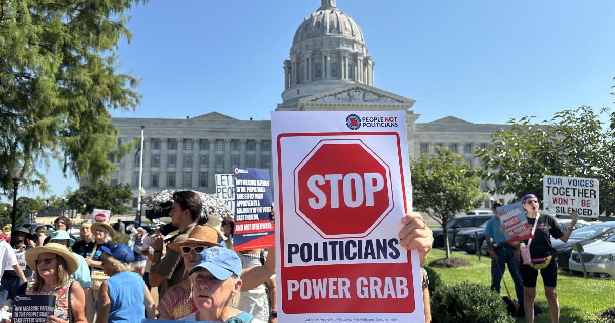
The findings display the stark overhaul that partisan redistricting fights kicked off by President Trump last year have caused for Americans across the country. The new congressional maps are increasingly drawn in ways that favor partisan politics over factors like geography and shared communities. That raises concerns among scholars about how the country’s hyperpolarized politics are affecting American democracy.

“If this trend continues, it really brings into question whether or not elected officials are really representing their constituents anymore, or if the voters are being randomly picked by mapmakers to squeeze out partisan advantage,” said Ben Raderstorf, a policy advocate at Protect Democracy and one of the paper’s co-authors.

The bare-knuckled partisan redistricting battle for the House began when Trump urged the Republican-controlled legislature in Texas, the second most populous state, to redraw its congressional map to help the party. The highly unusual plan prompted an immediate response from California, the most populous state, which held a successful referendum to tilt its map toward Democrats.

Other states followed, and Republicans are positioned to potentially gain nine seats because of redistricting.

The Protect Democracy report warns that such partisan tactics reduce faith in American elections generally and insulate incumbent lawmakers from public opinion. That can make political organizing more difficult, the report cautioned, potentially worsening the country’s already highly polarized politics. Both parties may also enter a “doom loop” where they embrace more aggressive and frequent redistricting efforts to avoid ceding any ground to their rivals.

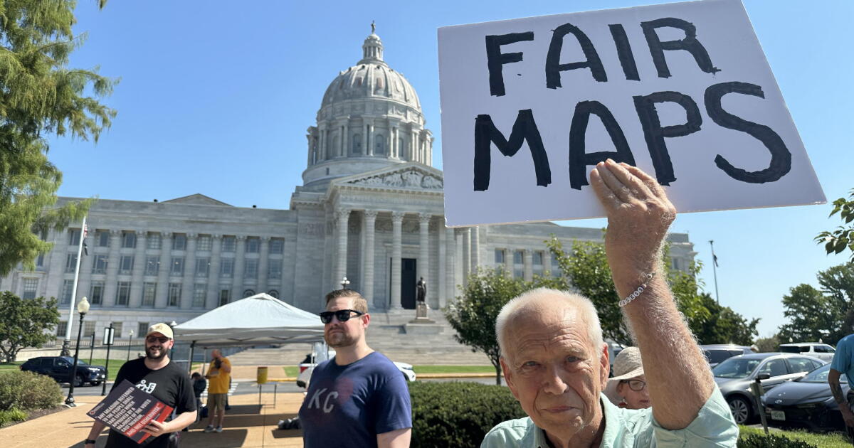
In some states such as Missouri, the mid-decade redistricting has created confusion for voters about which district they live in and which candidates will appear on their November ballot. After conflicting lower court rulings, the U.S. Supreme Court last week blocked new Missouri districts backed by Trump that had been used in the primary, leaving the state to revert to its previous districts for the general election.

The report concludes with a call for new electoral structures the authors believe would eliminate the potential downsides of partisan redistricting, like proportional representation or a formal truce between the parties to implement nonpartisan districting plans.

Nine states already use nonpartisan commissions to draw congressional district lines but those provisions have limits. California, for instance, suspended its nonpartisan maps with a referendum last year in response to Texas’ redistricting measures.

Such remedies would face long odds in Congress and statehouses, but scholars believe there are few other avenues to turn down the temperature in the partisan redistricting fights.

“This is only going to get worse until somebody stops it,” Raderstorf said. “The logic of gerrymandering points inevitably towards maximalist partisan advantage on both sides. There is no off-ramp other than reform. It is the only way to break the cycle.”

Brown writes for the Associated Press.

Source link

Japan, India, Ukraine: Why some countries are uneasy about new UN map | Maps News

In a historic move last week, the United Nations General Assembly voted overwhelmingly to encourage the use of new world maps which more accurately depict continents with their true sizes.

The move followed months of lobbying by the African Union, which itself adopted a new map earlier in February. A total of 164 countries voted in favour while six abstained.

Recommended Stories

list of 4 itemsend of list

The United States was the only member to oppose it. US representative Yaryna Ferencevych said before the vote that the resolution was “the reason this institution is losing its credibility”.

“Instead of focusing on genuine problems … this body is debating map projects from the 16th century,” she said.

But since the resolution was approved, at least three other countries have voiced concerns about the changes: India, Ukraine and Japan.

None are explicitly opposed to adopting a new projection. However, they are raising concerns about how certain disputed territories should be depicted.

Here’s what we know:

Why is there a new world map?

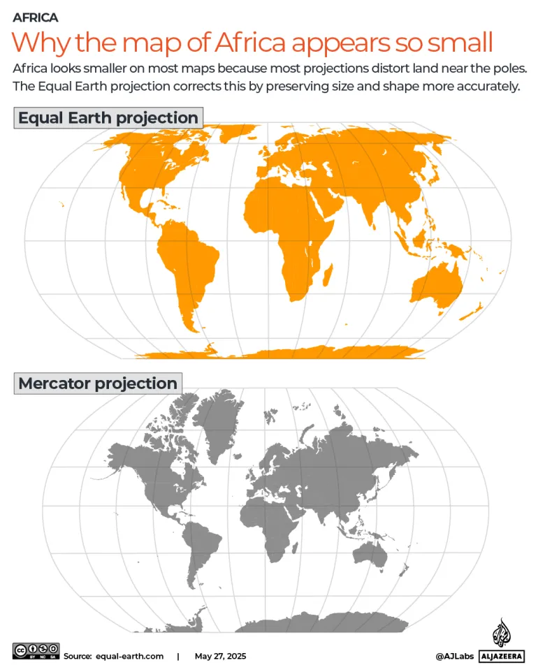
The UN endorsed a resolution promoting the Equal Earth projection of the world map, rather than the Mercator projection, which is currently widely used.

The resolution does not ban Mercator or impose a particular replacement – it merely encourages nations to adopt the Equal Earth version, which was created by three researchers in 2018.

The Mercator projection, which was produced by Flemish cartographer Gerardus Mercator in 1569 when the West was busy “conquering” new territories, attempts to show a three-dimensional globe on a two-dimensional surface. That is why countries closer to the poles appear much larger than countries at the equator.

For decades, map experts have pointed out that Mercator’s projection disproportionately shrinks the true size of the African continent and that of other developing regions, while making Europe and the US seem much larger by comparison.

For example, Greenland is shown as roughly the same size as Africa, but, in reality, it could fit into the continent 14 times over. Europe, which is portrayed as bigger than South America, is actually half its size.

Advocates from African countries pointed out that the map is problematic because of the size issues. Importantly, they argued, it reinforces negative perceptions of Africa.

Several cartographers have attempted to develop equal area maps. However, African activists specifically pushed for the Equal Earth projection map, which significantly expands Africa and shrinks Europe and the US.

Experts say while maps are inherently inaccurate because of the constraints of depicting a spherical world on a flat plane, the Equal Earth projection is as close as it gets.

INTERACTIVE - Africa map equal earth projection mercator-1748347339

Why is Ukraine worried about the new map?

Ukraine was one of six countries which abstained from the vote at the UNGA, along with Estonia, Georgia, Moldova, Serbia and Lithuania, who voted in solidarity with Ukraine.

Kyiv has complained that the Equal Earth projection depicts the Russian-occupied Crimean peninsula in a distinctly lighter shade than mainland Ukraine.

Russia illegally occupied and annexed Crimea in February 2014, a move the UN has denounced.

Although the peninsula is also shaded differently from mainland Russia on the new map, its yellowish tint appears closer to the Russian shade than Ukraine’s.

“Ukraine does not in principle oppose the core issue addressed in this draft resolution,” Andrii Melnyk, the country’s permanent representative to the UN, said in an address to the assembly.

Melnyk said Kyiv had asked for corrections before the vote but had not received positive responses. The new map, he said, could be tantamount to opening a Pandora’s box, enabling the “abuse and distortion” of the world map.

“It would be a truly fatal mistake for all of us, and for this General Assembly, to seek to correct a historical injustice in the geographical depiction of countries and continents by simultaneously allowing a deeply troubling interpretation of the text of this draft resolution,” he added.

What is Japan demanding?

Meanwhile, on Thursday, Tokyo, which voted in favour of the new map, said it had also asked for corrections to the Equal Earth projection because the map uses the same colours and shades for Russian territory as it does for the disputed Kuril Islands.

Russia and Japan have long fought over control of the four islands, known in Russia as the Southern Kurils and in Japan as the Northern Territories. In 1945, during World War II, the Soviet Union invaded and annexed the islands as part of a pact with Western Allies that stipulated the Soviets would take the disputed territory. The islands’ Japanese inhabitants were removed.

Subsequently, Japan and the US have claimed that the islands were not part of the original pact. The islands, however, remain under Russian administration.

In August this year, Russia’s President Vladimir Putin paid his first-ever visit to the islands, drawing condemnation from Japan. Prime Minister Sanae Takaichi called the visit “absolutely unacceptable”, saying it “offends the sentiments of the Japanese people”.

This week, Chief Cabinet Secretary Minoru Kihara said the Japanese embassy in the US has asked Equal Earth’s creators to change the map.

“Displays that contradict the Japanese government’s position are seen [on the map],” Kihara said at a news conference. “We need to prevent incorrect perceptions regarding our country’s territories and geographical names from spreading.”

Why is India uneasy about the map?

India also voted in favour of the Equal Earth projection, but on Sunday, the Ministry of External Affairs published a caveat regarding depictions of the disputed border territory of Kashmir.

Following the Indian partition of 1947, both Pakistan and India lay claim to the former state of Jammu and Kashmir, which had been controlled by the British through indirect rule. The region has subsequently been a flashpoint for tensions between the two rivals and has led to several wars.

Parts of Kashmir are administered by Pakistan, while other parts are administered by India. China, which also disputes some Kashmir territory with India, administers its northeastern portion.

In his statement, spokesperson Randhir Jaiswal noted that the UN vote was in favour of encouraging the use of equal area projections and that it had not made the use of any one map mandatory.

“India’s sovereign territory, including the Union Territories of Jammu and Kashmir and Ladakh, must be depicted in accordance with India’s official map,” he said. “Any inaccurate or misleading depiction is unacceptable.”

Source link

U.S. Supreme Court throws out Missouri congressional maps backed by President Trump

The U.S. Supreme Court again rejected a push to use Missouri congressional maps backed by President Donald Trump on Thursday, a loss for Republicans trying to maintain control of the House in the fast-approaching midterm elections.

The decision appears to clear the way for use of the old maps.

It comes after a pitched court battle shortly before ballots begin going out for the pivotal November elections. The maps were drawn to help Republicans gain an additional U.S. House seat.

It’s the second time the high court has refused to intervene to keep the Trump-backed maps in place.

Lieb writes for the Associated Press.

Source link

Can you guess the real size of each country on the new world map? | Maps News

Pick which country is bigger, then watch it morph from Mercator to Equal Earth projection to see how close you were.

The map of Africa is much larger than most people think. However, most classroom maps and atlases still understate it – a distortion embedded in the Mercator projection that has shaped world maps for more than four centuries.

The distortion in question is not subtle. On a Mercator map, which was designed for European colonial exploration and maritime trade in the 16th century, Greenland appears roughly the size of Africa, which is actually about 14 times larger.

The exaggeration increases the farther you travel from the equator, so it falls almost entirely on one half of the world, inflating Europe, including Russia, and North America while shrinking Africa, Latin America and South Asia.

INTERACTIVE - Africa map equal earth projection mercator-1748347339

To address this, the United Nations General Assembly (UNGA) voted 164 to 1 on Friday to adopt a resolution promoting the Equal Earth projection, which shows continents in their true proportions, as an alternative to Mercator.

Led by Togo on behalf of the African Group and backed by the African Union, it encourages schools, institutions and tech companies to switch, correcting the shrinking of Africa and other equatorial regions. The African Group is the largest regional voting and dialogue bloc at the UN, consisting of 54 African Union member states.

Map quiz: Pick the bigger country

See it for yourself: pick which country is bigger, then watch it morph from Mercator to Equal Earth to see how close you were.

How did countries vote?

The United States was the only country to vote against the resolution calling the measure a “radical ideological project”. Serbia, Estonia, Georgia, Lithuania, Moldova and Ukraine abstained.

US representative Yaryna Ferencevych said before the vote that the resolution is “the reason this institution is losing its credibility”. “Instead of focusing on genuine problems … this body is debating map projects from the 16th century,” she said.

Friday’s resolution is nonbinding, intended only to encourage the world’s default maps to change. The UN said it does not ban Mercator or impose a replacement, but simply encourages wider use of the Equal Earth projection.

Togo’s Foreign Minister Robert Dussey told the UNGA that maps shape education, imagination and collective perception, and that the resolution affirms African reality.

The African Union adopted Equal Earth in March. Togo is planning a meeting in Lome early next year, with UNESCO, the African Union and technology companies including Google, to work out what implementation looks like in practice.

Why flat maps lie

Every flat map lies because the Earth is a sphere and no projection can flatten it without distorting something: shape, area, distance or direction.

Gerardus Mercator, a cartographer and geographer who published the world map in 1569, chose to preserve angles and straight bearings, a trade-off that made sense for 16th-century ships but has kept shaping perceptions of the world for nearly 500 years since. Equal Earth makes the opposite trade-off, preserving true area so continents can be compared honestly, at the cost of slightly bending their outlines.

Source link

What different world maps get right – and what they get wrong

The now widely used Mercator map was created in 1569 by Flemish cartographer Gerardus Mercator.

Its main purpose was to help European sailors navigate the oceans, as cartography Professor James Cheshire at University London College explained.

“He wanted a straight line to be drawn on a map to look like a straight line in reality if you followed a compass bearing,” he told the BBC. “That was what it was intended to do, and that’s what it does brilliantly well.”

To keep those angles correct on a flat map, Mercator had to stretch the grid lines wider as they moved away from the equator toward the poles.

His map accommodates for the curvature of the Earth by making countries near the equator seem much smaller than they are, with countries nearer the poles appearing stretched.

The distortion is a result of it being impossible to accurately represent the surface of a globe on a two-dimensional chart.

More than 450 years on, Mercator’s creation is still the basis for many of the maps we see in classrooms, on TV and online, including Google Maps.

But critics of the Mercator map say there is a psychological effect to viewing some places as smaller than they actually are and others as larger, as we instinctively view bigger things as more important.

For Kenyan geographer Kioko Muendo, this has implicitly downplayed Africa’s vast resources, population and investment opportunities.

“Maps are more than just guides for travellers – they shape how regions are perceived politically and economically,” he told the BBC.

Source link