WASHINGTON — A Florida airport was cleared to be renamed after President Trump on Monday, hours before the president separately revealed plans for a Miami skyscraper planned to house his presidential library.
Florida Gov. Ron DeSantis signed a bill allowing Palm Beach International Airport to be renamed the President Donald J. Trump International Airport. The change is set to take place in July, formally rebranding the airport near Trump’s Mar-a-Lago estate.
Later Monday, Trump posted a video to social media that appears to show digital renderings for his presidential library. Set to dramatic music, the video unveils a piercing tower along the Miami skyline emblazoned with the signature “Trump” lettering seen on his other towers.
The video includes panning shots of the tower’s exterior and interior, with a presidential jet parked in the lobby alongside a gold escalator like the one Trump rode down while launching his presidential campaign in 2015. Other shots show a giant ballroom like the one he’s planning for the White House, a replica Oval Office, rooftop gardens and a large, gold statue of Trump.
A credit says the design comes from Bermello Ajamil, a Miami-based firm. Trump posted the video with no explanation beyond a link to a new website for the library. The website says, “coming soon,” with a link to donate money.
The White House did not immediately respond to questions about the plans.
Miami Dade College gave up a nearly three-acre plot of downtown real estate as a gift for the future library. A judge in December dismissed a complaint challenging the gift on grounds that the college’s board didn’t give sufficient public notice. The site is valued at more than $67 million.
Trump’s son Eric previously said the library will be “one of the most beautiful buildings ever built” and “an Icon on the Miami skyline.”
Since he returned to the White House, Trump has pressed to get his name on all manner of American institutions, including the U.S. Institute of Peace, the Kennedy Center for the Performing Arts and U.S. currency.
In Palm Beach, a stretch of road from the airport to Trump’s estate was recently renamed Donald J. Trump Boulevard.
WASHINGTON — A federal arts commission on Thursday approved the final design for a 24-karat gold commemorative coin bearing President Trump’s image to help celebrate America’s 250th birthday on July 4.
The vote by the U.S. Commission of Fine Arts, whose members are supporters of the Republican president and were appointed by him earlier this year, was without objection. It clears the way for the U.S. Mint to begin production on the coin, whose size and denomination are still under discussion.
“As we approach our 250th birthday, we are thrilled to prepare coins that represent the enduring spirit of our country and democracy, and there is no profile more emblematic for the front of such coins than that of our serving President, Donald J. Trump,” U.S. Treasurer Brandon Beach said in a statement.
The unprecedented move marks yet another example of Trump and his allies circumventing conventional past presidential practices — and even the law — to get what he wants. It’s the latest instance of Trump putting his name and likeness in the historical archive, following his renaming of the U.S. Institute of Peace, the Kennedy Center performing arts venue and a new class of battleships, among other tributes.
Federal law says no living president can appear on U.S. currency. But Megan Sullivan, the acting chief of the Office of Design Management at the Mint, said the Treasury secretary has authority to authorize the minting and issuance of new 24-karat gold coins, which Scott Bessent has used to get around that prohibition and put Trump on a coin.
She presented the coin’s final design at the commission’s March meeting on Thursday and said Trump had approved it.
“It is my understanding that the secretary of the Treasury presented this design, as well as others, to the president and these were his selection,” Sullivan said.
The White House and the Mint did not immediately respond to electronic and telephone requests for comment.
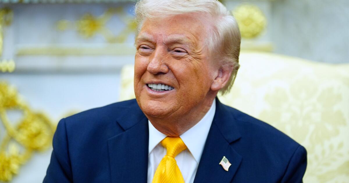
The front of the coin features an image of Trump in a suit and tie and with a stern look on his face. His fists rest on top of what is supposed to be a desk as he leans forward. Lettering on the top half of the coin spells “LIBERTY” in a slight arc. Directly underneath that are the dates 1776-2026. The words “IN GOD WE TRUST” are at the bottom, with seven stars on one side of the coin and six stars on the other side.
The reverse side depicts a bald eagle midflight with “UNITED STATES OF AMERICA” on the right side and “E PLURIBUS UNUM” on the left side.
“I know it’s a very strong and a very tough image of him, and I think it’s fitting to have a current sitting president who’s presiding over the country over the 250th year on a commemorative coin for said year,” said Commissioner Chamberlain Harris, a top White House aide to Trump.
The coin will be part of a “very limited production run,” Sullivan said, but the number has not been determined. The size and denomination of the coin also have not yet been decided, she said. Some commissioners noted Trump’s fondness for big things as they advocated for the largest size coin.
The Mint, which is part of the Treasury Department, has looked at a size for the Trump coin that is larger than its 1-ounce gold coin, which is about 1.3 inches in diameter, Sullivan said.
Its largest coin is 3 inches, “so we’re looking somewhere in there,” she said.
“I think the president likes big things,” said Commissioner James McCrery II, who was the architect on Trump’s design proposal for a 90,000-square-foot ballroom addition to the White House. The fine arts commission approved that proposal at its February meeting.
Harris told McCrery she agreed with him. She works in the White House as a special assistant to the president and deputy director of the Oval Office.
“I think the larger the better. The largest of that circulation, I think, would be his preference,” Harris said, speaking of Trump.
There are few greater muses than one’s own childhood. In recent months, this idea has taken visual form across fashion runways, with brands from Chanel to Acne Studios showcasing childlike sketches, often referred to as ‘naive design’. The aesthetic favors deliberate roughness and mistakes over a sterile, polished sheen.
Book covers are the latest medium to embrace the trend. Scribbles, doodles, crayon marks and stickers — evoking Lisa Frank and anime cartoons — have begun appearing on prominent Gen Z contemporary fiction covers. The more childish and unrefined, the better.
The covers, which often accompany literary fiction written by women, signal a particular emotional register of naive, sticky chaos that youth promises. The visual language recalls a simpler time — a reclamation of an innocence lost. For millennials and Gen Z readers who worship collectibles like Labubus, friendship bracelets and butterfly hair clips, it’s natural that art direction would follow suit — sometimes with an ironic twist. Often, the design’s playfulness obscures the protagonist’s malaise.
The book cover trend, imbued with nostalgia for childhood, promises fiction that grapples with the pangs of adulthood in an age of precarity. In her Substack, cultural critic and novelist Natasha Stagg commented on the trend, noting, “Reverse-image searching these images turn up books on early childhood education, dealing with anxiety or migraines, or teaching a kid to color outside the lines as an artistic parent.” The book trend cover suggests collective angst about adulthood, highlighted by a cultural fixation on “girlhood” that sparked a spate of online think pieces in recent years.
It’s fitting, then, that the aesthetic has been adopted by Gen Z fiction writers like Honor Levy, whose paperback edition of “My First Book” includes girlish heart stickers on a hot pink background. The Y2K aesthetic elicits a young girl’s diary. Meanwhile, the 2025 novel “Unfit” by Ariana Harwicz, about a mother losing her children in a custody battle, uses erratic crayon scribbles on its cover. In the fall, McSweeney’s Quarterly Concern was contained in a binder with a Lisa Frank-style aquatic wonderland on the cover. This month, Cazzie David released a book of essays about early adulthood titled “Delusions: Of Grandeur, of Romance, of Process” with a cover resembling a child’s birthday cake.
(New Directions Publishing, Penguin Books)
Writer and culture critic Drew Zeiba noted the trend in his June 2025 Substack post. “I wonder if it represents a fed-up-ness with prior or concurrent trends in book design,” writes Zeiba over email. “A move away from the layered, the blobby, the clean — to something with more illusion of or allusion to an id.”
“Not for nothing, I assume adult coloring books sell better than literary fiction,” says Zeiba. “I’m struck by that in a way the crayon or marker drawing is provisional — there’s no final form to it.”
This January, novelist and Forever Magazine co-founder Madeline Cash released her highly anticipated debut novel, “Lost Lambs.” The story follows a family unraveling amid open marriages, conspiracy and emotional turmoil. Designed by Na Song, the cover features drooping blue crayon text and a small illustration of a girl.
The cover was heavily influenced by Henry Darger’s Vivian Girls. “I was attached to this Henry Darger painting when I was writing the book. I felt like that was a really accurate visual representation of little girls running away from utter chaos,” says Cash.
“The childish scribbling handwriting is also a red herring for some of the more serious and sinister themes in the book, “ says Cash.
“Having read Cash’s, I’m struck by the fact that the children in the book — and children are central to the book — are really insightful and transformative, and ‘lost lambs’ actually refers in the text to a specific group of adults,” adds Zeiba.
A similar artistic logic underpins Sophie Kemp’s breakout 2025 novel, “Paradise Logic,” which gained attention for its unsettling cover. The book cover is an existing painting by Brooklyn-based artist Naruki Kukita, selected by veteran art director Martha Kennedy with Kemp’s input. Kennedy had come across “Virtual Temptation in Eden” in a weekly art newsletter called “It’s Nice That.” The image invokes a children’s coloring book with darker undertones, blending various cartoon and drawing styles to depict Adam and Eve in paradise. A cartoon snake lurks behind them.
The design mirrors the memorable prose. “This novel showcased one of the most original voices I’ve ever read. I would describe it as a psychosexual fever dream,” says Kennedy. “I recall the editor calling it ‘the first true Gen Z novel.’”
Kemp recalls sending a lengthy email about the book cover inspiration. “I want something super maximalist. I want it to be a preexisting image. And I wanted to do something that is shocking or crazy,” says Kemp. Kennedy presented Kukita’s painting, and it was love at first sight for Kemp.
(New Directions Publishing, Simon & Schuster)
“Kukita’s combination of finely crafted painterly portraiture and flat graphic anime (often in very intense sexual combination) seemed like a perfect match for the tone of this novel,” says Martha Kennedy, who served as the art director at Simon & Schuster.
Then, enter Comic Sans typeface — a perfect dash of irony. “Let’s use a typeface that feels kind of wrong,” Kemp recalls prescribing. “I used Comic Sans for the first time in my 35-year career for the rest of the type. I felt that was some sort of weird pinnacle in itself,” Kennedy explains over email.
Kemp sees a thematic alignment between her and Cash’s book designs. “Mine and Madeline’s books are about naive female characters,” Kemp says. “It makes a lot of sense with the protagonist of my novel, who’s an extremely naive young woman, for the book cover to match that tone that I created.”
While working in marketing, Cash recalls another book cover trend she calls “book blob.” The blob was earth-toned and splashed bestselling covers for years. “With any kind of viral aesthetic: one of those books did well, so they engineered every cover to emulate that, because people were drawn to them,” says Cash. “It looks like all the content was the same and ubiquitous. It is a disservice to a lot of those books.”
“I really wanted it to stand out,” says Cash about her own cover.
Connors is a writer living in Los Angeles. She hosts the literary reading event Unreliable Narrators at Nico’s Wines in Atwater Village every month.