GRAMMY-NOMINATED producer Tay Keith has been found dead in Nashville.
Brytavious Chambers, 29, better known as Tay Keith, was found dead in his apartment earlier today.
Sign up for the Showbiz newsletter
Thank you!
Tay Keith has been found dead in his apartment in NashvilleCredit: GettyInvestigators say there was no suspicion of foul playCredit: Getty
Police said his body was discovered while officers were performing a welfare check at his home.
Investigators say there was no evidence of foul play, but the exact cause of death has yet to be determined.
In a post on social media, Metro Nashville PD wrote: “No foul play is suspected in the death of Brytavious Chambers, 29, also known as the Grammy nominated record producer Tay Keith.
“He was found dead in his Martin St apt this afternoon by officers performing a welfare check.
The producer’s cause of death remains unknownCredit: GettyKeith currently holds the record for the most No.1s on the R&B / Hip-Hop chartCredit: WireImage
“His death is unclassified pending autopsy results.”
Throughout his career Keith worked with a wide range of music artists, including Beyoncé, Travis Scott and Drake.
The Memphis hitmaker enjoyed huge success on the Billboard Hot 100, earning 11 top 10 hits and four No.1 records.
He was also the mastermind behind Travis Scott’s “Sicko Mode” and Drake’s “First Person Shooter”.
Keith currently holds the record for the most No.1s on the Hot R&B / Hip-Hop songs chart this decade – with six.
His work even earned him a coveted Grammy nomination in 2019.
In the aftermath of his death, tributes for the producer have poured in.
Artist and childhood friend Blocboy JB shared photos of the pair as teenagers with the caption: “Damn Cuz You Just Hurt Me Bad.”
Keith was one of the mastermind’s behind Travis Scott’s ‘Sicko Mode’The song – featuring Drake – has been streamed over 2.5bn times on Spotify
He also posted a video of their call history, writing: “We talked everyday yeen tell me you was leaving.”
Fellow Memphis producer Hitkidd also expressed his disbelief, posting a picture of the pair on Instagram.
The caption said: “I ain’t even got the words, we been doing this since 2010.”
Born on September 20, 1996, Keith stated making music when he 14.
He later received a bachelor’s degree from Middle Tennessee State University.
Signed to a publishing deal with Warner Chappell Music, he was also a member of BMI.
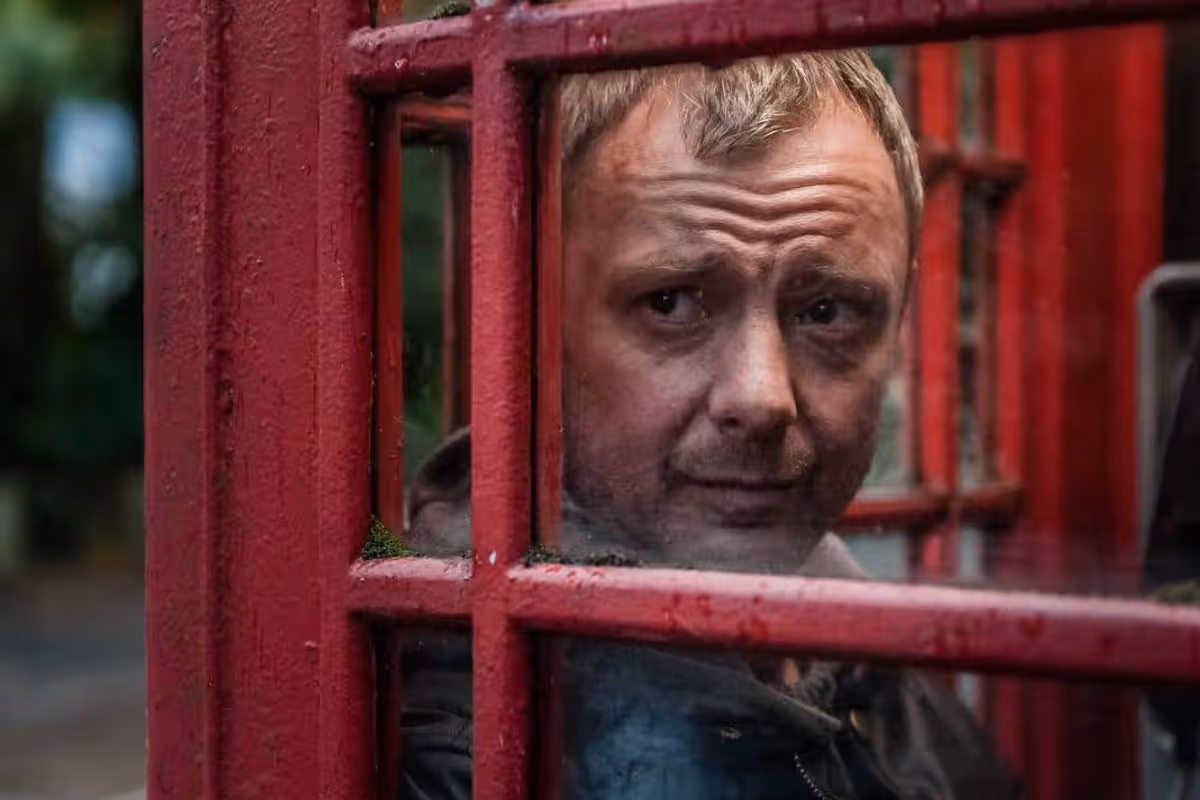
WARNING CONTAINS SPOILERS: Prey originally aired on ITV in 2014 and starred John Simm and Rosie Cavaliero as two detectives
Angie Quinn Screen Time Reporter
23:04, 02 May 2026Updated 23:11, 02 May 2026
Prey season one stars Grace actor John Simm. (Image: ITV)
British crime thriller Prey has finally landed on Netflix and is already one of the most-watched shows.
*Warning contains spoilers* Prey originally aired on ITV from 2014 to 2015. The two-season thriller follows two criminal cases involving police officers in the Manchester area, with DS Susan Reinhart (Rosie Cavaliero) investigating both.
Grace icon John Simm stars in the first season as DC Marcus Farrow. The detective found himself in a tight spot when his ex-wife and sons were brutally murdered, and all of the criminal evidence points to him.
He is able to flee when the police van transporting him crashes, and Farrow runs off so he can find out who really murdered his family.
After taking the investigation into his own hands, Farrow discovers that it was DS Reinhardt’s boss, DCI Andrea MacKenzie (Anastasia Hille), who had been responsible for their deaths.
Life on Mars actor Philip Glenister leads the cast in the second season as he plays prison officer David Murdoch.
When Murdoch accompanies inmate Jules Hope (MyAnna Buring) on a routine hospital visit, he receives a call informing him his pregnant daughter Lucy (Sammy Winward) has been kidnapped, and he must follow the captors’ orders if he wants her to live.
Prey features a wealth of acting talent across the two seasons, including EastEnders’ Heather Peace, Doctor Strange’s Benedict Wong, Adrian Edmondson, Harry Potter’s Ralph Ineson, and Line of Duty’s Craig Parkinson.
At the time of writing, Prey is currently in the #5 position in Netflix’s UK TV chart, according to FlixPatrol. On Rotten Tomatoes, the series is also rated 100% on the Tomatometer.
The series has proved a hit with viewers, with many taking to IMDb to share their thoughts. “Great series, worth the time and a good binge watch – Brits do it best!” penned one viewer.
Another said, “I can’t believe that I just found this gem. Outstanding acting from virtually everyone, non-stop action, great storyline. Every character is so believable, so real. Three episodes, so well done!”.
Elsewhere, another fan wrote: “Absolutely loved this action packed thriller” to which a different account added: “Although John Simm is excellent in every role he plays I really thought this was one of the best.”
Prey seasons one and two are available to watch on Netflix
OLIVIA DEAN stormed the opening night of her debut arena tour – but left fans gutted by not performing No1 hit Rein Me In.
She received a hero’s welcome at Glasgow’s OVO Hydro, fresh from a stellar few months which saw her scoop four Brit Awards, three Mobos and the Grammy for Best New Artist.
Sign up for the Showbiz newsletter
Thank you!
Olivia Dean left fans gutted by not performing No1 hit Rein Me In on the opening night of her debut arena tourCredit: LOLA MANSELLOlivia told the crowd that her whirlwind success over the past 12 months has been a shock, even to herCredit: Getty
But she surprised the audience by deciding not to include her Sam Fender collaboration, which has so far spent eight weeks at the top of the charts, on her 23-track setlist.
So fans had a singalong to it outside the venue afterwards instead.
Rein Me In won the Brit Award for Song of the Year in February, but Olivia had plenty of other brilliant tunes to satisfy the sold-out arena.
As floor-to-ceiling white stage curtains opened to reveal the singer, she looked cool, calm and collected, despite the high expectations on her shoulders.
She breezed out in a pink sequined dress and was greeted with echoing singalongs of utterly joyous tracks Nice To Each Other and So Easy (To Fall In Love).
She then told the crowd that her whirlwind success over the past 12 months has been a shock, even to her.
She explained: “This is crazy. Apologies if I get emotional tonight but I just can’t believe how many people are here. Today we were driving in and I drove past King Tut’s. I played there two years ago, and there was 300 people in the room.
“Now I’m here with all of you, so thank you so much for being here.
“Just enjoy yourselves. Sing, dance, cry, whatever you want. I’ll certainly be having a good time.”
And things got more emotional as she performed UFO, from her 2023 debut album Messy, which she said is about feeling “overwhelmed.”
When the audience spontaneously waved their phone torches in the air to light up the arena, she wiped away tears of joy.
SET LIST
The Art Of Loving (Intro);
Nice To Each Other;
Lady Lady;
So Easy (To Fall In Love);
Close Up; Let Alone The One You Love;
Messy;
UFO;
Touching Toes;
I’ve Seen It;
Carmen;
Echo;
Time;
Loud;
A Couple Minutes;
The Hardest Part;
Baby Steps;
Ladies Room;
Move On Up (Curtis Mayfield cover);
OK Love You Bye;
It Isn’t Perfect But It Might Be;
Dive; Man I Need
One of the set’s unexpected highlights came as she sang Loud live for the first time.
And she did so in a flowing white skirt from a flower-shaped stage in the centre of the room.
Against stripped-back instrumentation, the haunting track showed her vocals at their most powerful.
Back on the main stage, disco balls descended from the ceiling for a more upbeat section which had her skipping and dancing across the stage, along with her nine-piece band.
As she wrapped up the gig, she said: “I never imagined I could have my own headline arena tour. It’s mental.
“Thank you so much for listening and just believing in me.”
And while she didn’t do Rein Me In, she finished her set with fan favourite Dive and her first No1, Man I Need.
She will be back on stage tomorrow at Manchester’s Co-op Live before six nights at London’s O2 Arena, and further shows in Dublin and across Europe.
Olivia is at the top of her game right now and if you want a warm, musical hug, this concert is it.
Duran set for summer
Duran Duran have dropped new single Free To LoveCredit: Stephanie Pistel.The band have worked on a single with Nile RodgersCredit: Alamy
DURAN DURAN have dropped new single Free To Love and have signed up presenter Clara Amfo to appear in the music video.
They gave Radio 2 a first play of the track yesterday morning and it’s a banger, with Simon Le Bon and the band working on the single with Nile Rodgers – 40 years after he produced their Notorious album.
In an exclusive chat after the single dropped, John Taylor told me: “We wanted to write something uplifting for these times we find ourselves in. A feelgood piece for an imaginary dance floor.
“I always want to feel the DNA of classic disco in our music, reframed for now. Nile locks us into that timeless groove, bringing a sense of optimism. It’s a reminder that music can still bring people together.”
If you’ve not heard Free To Love yet, definitely give it a listen. It’s the perfect summer song.
Lady Gaga eyes six second Oscar
Lady Gaga wants an OscarCredit: Splash
LADY GAGA is eyeing up another Best Original Song nomination at the Oscars after recording three songs for Devil Wears Prada 2.
After Gaga, released her Doechii collaboration Runway earlier this month, I told how the superstar had a surprise in store for fans and had contributed more to the film’s soundtrack.
I can reveal that as well as Runway, Gaga has recorded Shape Of A Woman which she performs during the film, plus a third song, which is called Glamerous Life.
It is a stripped-back emotional ballad – similar to her 2022 single Hold My Hand for the Top Gun: Maverick sequel.
On the new song, Gaga sings: “I might need a hero to save me from breaking. Can I be myself in a world that’s just faking it?”
In 2019 Gaga won Best Original Song at the Oscars for A Star Is Born’s Shallow and if Prada 2, which is in cinemas from May 1, takes off like I think it will, she will have another Oscar nomination under her belt.
Gaga co-wrote Shallow with Mark Ronson and performed it at the Oscars ceremony with her movie co-star Bradley Cooper.
Sofa, so good Kylie
Kylie Jenner used her cream sofa as the backdrop for a load of thirsty Instagram snapsCredit: Instagram/kyliejenner
ANYTHING Kylie Jenner touches seems to turn to gold.
So I think sofa superstore DFS should be having a serious think about signing her up, after the American reality TV star turned beauty mogul decided that she would use her cream sofa as the backdrop for a load of thirsty Instagram snaps.
Over two million of her fans have now liked the images, which Kylie captioned: “Can’t a girl have fun?”
I can think of more places to have a laugh than on my sofa wearing a bra, but each to their own.
Ant & Dec go crazy
We revealed back in February that Ant & Dec were in talks for a new ITV show all about crazy golfCredit: Rex
And now I’m told the Geordie duo have had the series green-lit by telly chiefs, and the pair are already busy filming with a host of golf-mad hopefuls.
It is based on US show A Hole In One, where contestants battle it out on a seriously hard silly course for cash.
A source said: “Ant and Dec have been given the nod and they’re preparing to film their new ITV show later this summer.
“Rather than having the public competing like in the US version, they’ve got a load of golf fans to sign up and play.
“It’s going to be the weirdest and wackiest game of crazy golf ever, with some big personalities trying to putt a winner.
“Ant and Dec are huge golf fans so really wanted to get the concept off the ground. ITV loved it and now it’s being pitched for a primetime slot on Saturdays. It’s family-friendly and with the great personalities they’ve got on board, they think it could be a ratings winner.”
Ant and Dec will have a hell of a job fitting this new show into their schedules, with the pair due to jet off to Australia later this year for the next series of I’m A Celebrity . . . Get Me Out Of Here!
But if I was getting paid to spend some days in the sun mucking around on a crazy golf course, I’d definitely make some time in my diary.
Liam bigs up Oasis return
Liam Gallagher is bigging up more Oasis live showsCredit: Getty
LIAM GALLAGHER is fuelling what we all know – Oasis will be coming back with more live shows.
And now the motormouth has sent fans in Italy into overdrive after heading to Rome.
He was mobbed outside his city-centre hotel, where one asked if he and Noel would return to the city.
Liam replied: “Without a doubt. We’re coming next year.”
I revealed the rockers are plotting more reunion dates in 2027 after taking this year to recharge.
A huge run across the UK, Europe and North America is heavily tipped as the brothers celebrate the 30th anniversary of their heyday.
For a man meant to be on holiday, Liam is putting in serious hours in the Oasis promotions department.
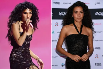
Tyla has A* pop lined up
Tyla has announced her second album and when it will dropCredit: Tod Dow Young/ Fallon Tonight
TYLA has announced her second album A*Pop will drop on July 24.
The singer was in New York to dish out copies of her signed i-D Magazine cover and celebrated the release date with her fans, saying: “Initially going into this project, I was nervous – like, ‘Where do we go from here?’
“But I realised that the music really reflects where you are in life, and the way the new album sounds came on its own, it fell into place.
“There are some exciting features but those are all still under wraps for now.”
Reverand And The Makers also have exciting news for fans.
Today they have dropped new single F*ked Up with Robbie Williams.
NICK GRIMSHAW knows an act who has already been booked to headline Glastonbury 2027, after I revealed in January his close pal Harry Styles will top the bill next summer.
On his Sidetracked podcast Nick seemed to confirm my story by saying: “I know someone that’s playing. I can’t say who. So two spots to go . . . Maybe. They might be booked.”
VINYL fans with deep pockets should start saving now, as the White Label Auction is back.
The annual sale in aid of The Brit Trust begins on June 23, with hundreds of rare white label test pressings going under the hammer through Omega Auctions.
Among the hottest lots are signed releases from Sam Fender, The Cure, Roxy Music and Yungblud.
The charity event has already raised more than £200,000.
STRICTLY fans can swap the sofa for the dance floor later this year, with the show’s pros heading to Warner Hotels for a string of star-studded breaks.
Kai Widdrington and Katya Jones will lead the glittery line-up, with guests able to watch live performances, snap photos and even learn a few moves themselves.
And it’s not just sequins on offer.
Singers Chesney Hawkes, Michael Ball, Alexandra Burke, Will Young and Russell Watson are all booked to perform at various locations across the country.