AN INTERIOR designer has revealed the five design horrors that are making your home look cheap.
So if you want to impress your guests with your interiors, then you’ve come to the right place and will need to take notes.
As Halloween finally arrives, it’s not just ghosts and ghouls that could be haunting your home, as according to this design pro, there are five common design choices that can have the eerie effect of making your space look sterile, cheap, and dark.
From overdone velvet and mirrored furniture, to dark and dingy lighting choices, Molly Woodward-Moor, interior designer and creative director at Stone Superstore, has shared the interior missteps that could turn your dream home into a design nightmare.
Not only this, but she’s also revealed how to banish these horrors for good, ensuring that your home looks fabulous, but without breaking the bank.
Overdone design schemes
According to Molly, while setting a design scheme can help to create balance and cohesion in a room, when you saturate the space with too much, the elements tend to compete for attention.
She explained that there’s a variety of design themes that have been overdone and as a result, have got to go.
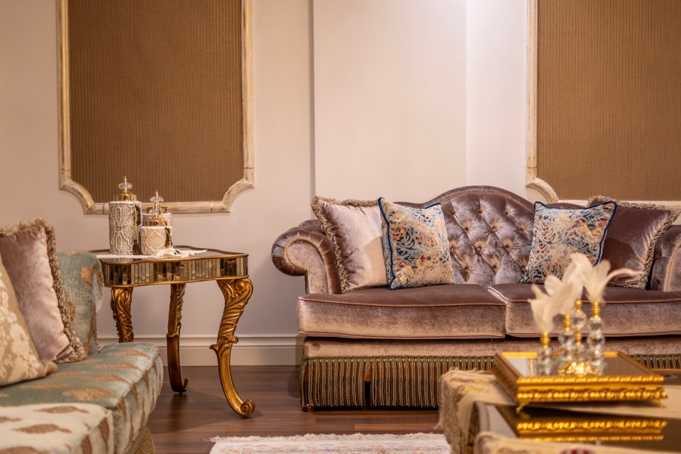
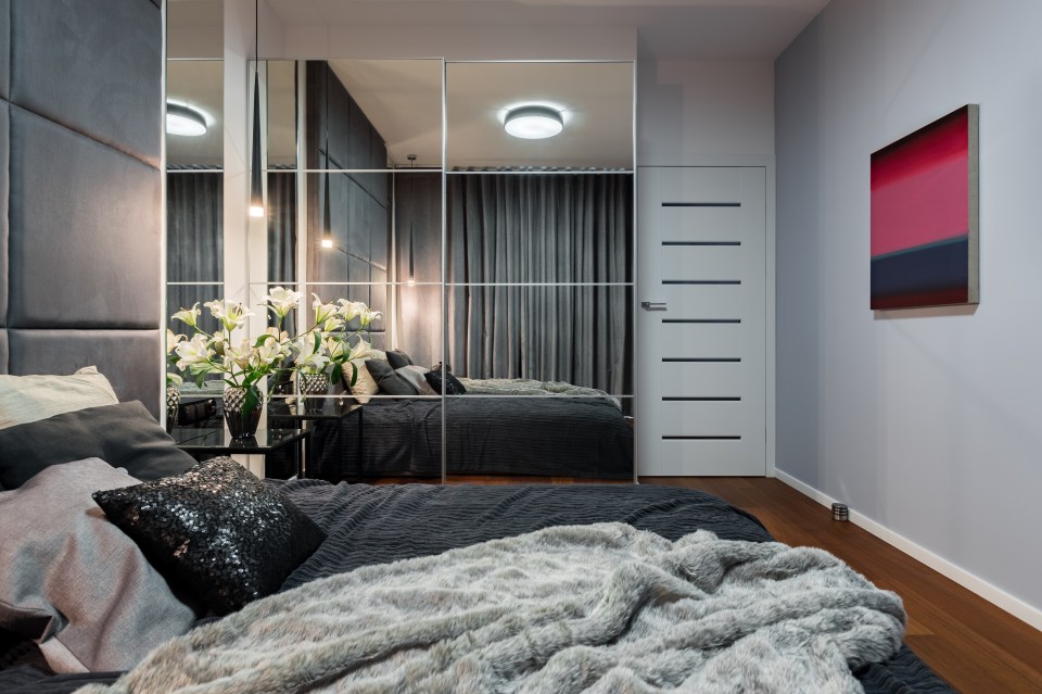
Molly said: “An interior style we’re all use to seeing on social media is the over saturation of the glamourous grey aesthetic, which includes accents such as velvets, mirrored furniture, and high-shine accessories, easily crossing the line into looking harsh and overly themed, rather than having a luxurious appeal.
“For a high-end finish, use luxurious accents sparingly, and balance shiny finishes with matte textures for a more balanced feel.
“Furthermore, over committing to specific themes such as ‘beach house’, can make a home feel more like a caricature than a well-designed space.
“We tend to see this a lot in Airbnb spaces, which can be a great way to lean into the escapism of a holiday, however when it comes to home design, too many literal design elements can make the home look kitschy and overdone.
“Instead, take inspiration from themes without being too literal, for example, if you’re aiming for a coastal vibe, focus on light, airy colours, natural textures and subtle nods to the theme through rattans, pale woods and white linens.”
Poor lighting choices
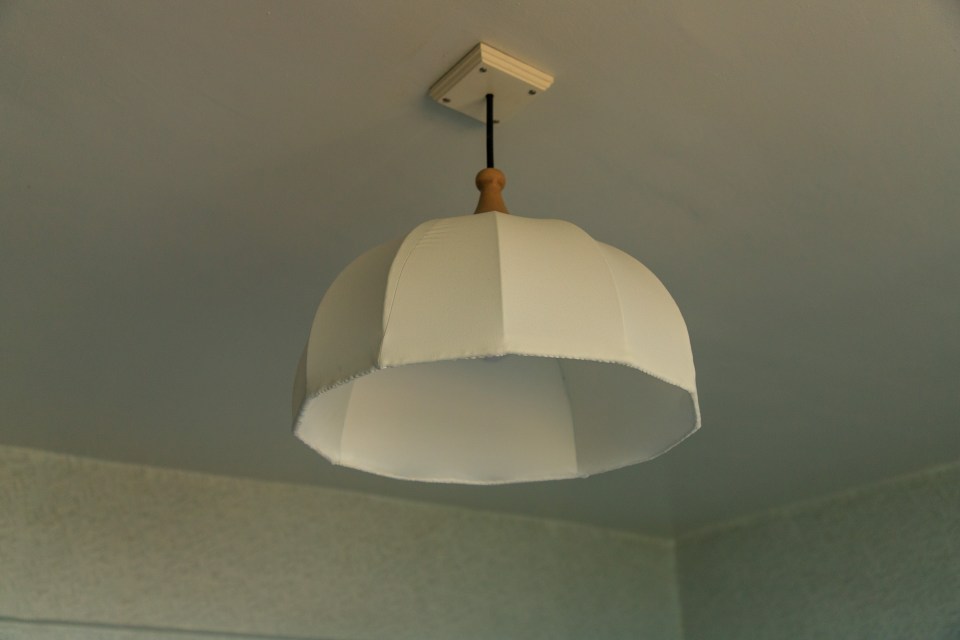
Not only this, but according to Molly, lighting is one of the most instantly effective ways to set a mood in your interiors.
As a result, not paying attention to how you light your space can make even the most well-designed space feel uninviting or cold.
Molly stressed: “To keep your space feeling cosy and welcoming, whilst also being well lit, consider layering your lighting sources.
“Introduce task lighting for specific activities such as a lamp for reading, along with accent lighting such as wall sconces, fairy lights, or picture lights to add depth and interest to a room.
Interior Design expert advice
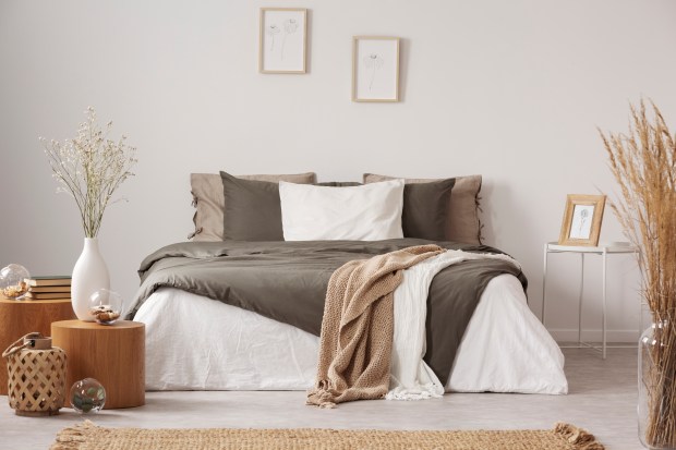
“Lighting is also a great opportunity to create zones throughout a room, for example, place a floor lamp next to a reading chair to create a cosy nook or use table lamps on side tables to add warmth to seating areas.
“Furthermore, adding strategically placed lanterns or tea lights throughout a space adds a flickering, warm glow that can’t be replicated through traditional lighting sources.”
Fake plants
If you’re a fake of fake plants, prepare to be attacked.
According to Molly: “Fake plants can often look plastic and artificial, and usually tend to be spotted in an instant, leading to the space looking lifeless and staged.
“Whilst fake plants require less upkeep, they still accumulate dust and dirt, requiring frequent cleaning, offering a false sense of ease.
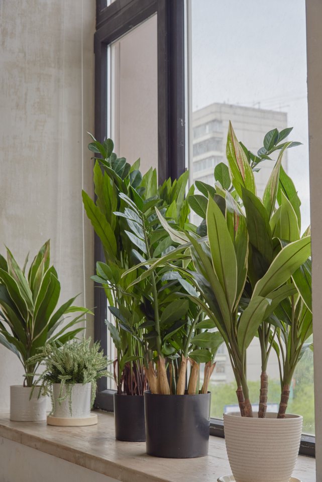
Swap out fake plants for low-maintenance plants such as succulents that thrive indoors whilst adding life and colour to your space
Molly Woodward-Moor
“Not to mention fake plants offer no benefits that typical houseplants do such as cleaning indoor air and increasing humidity.”
As a result, she recommended: “Swap out fake plants for low-maintenance plants such as succulents that thrive indoors whilst adding life and colour to your space, all while improving air quality.
“Other ways to introduce nature into your space include dried flowers such as pampas grass for a rustic or bohemian vibe to your space, or herbs that offer both greenery and also a practical purpose in the kitchen.”
Generic décor
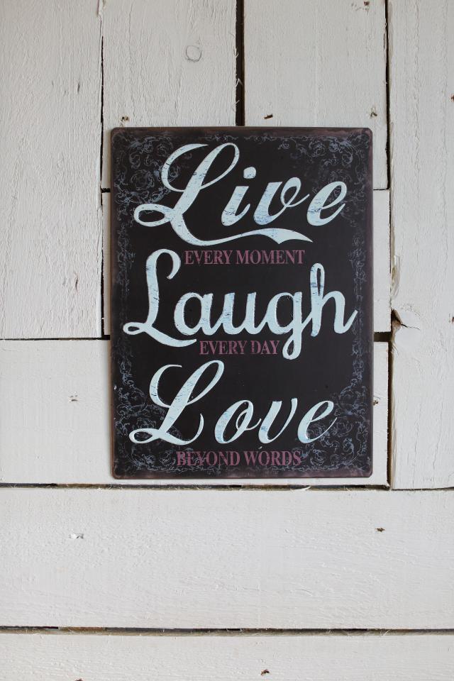
In addition to this, if you want your home to be interior pro approved, you’ll need to get rid of the Live, Laugh, Love sign in your bedroom.
According to Molly: “Décor plays a key role in enhancing a home’s overall aesthetic and reflects personality.
“However, the use of generic mass made décor items can give a home an impersonal feel.
“Generic décor such as mass-produced artwork or quotes often lack a personal connection, which can make a space look more like a showroom than a home.
“Additionally, these items often follow fleeting trends rather than timeless designs, which can lead to the space quickly feeling outdated and will require frequent changes of décor choices.
Trends interior designers hate
IF you want to ensure that your home looks glam, here are the trends that interior designers can’t stand.
NO YELLOW: According to Bilal Rehman, yellow paint in a bedroom is a big no no.
He said: “If you want everyone to know you’re a horse girl then yellow is perfect for you.”
SIGN OFF: Kelly Hoppen shared her honest thoughts on Live, Love, Laugh signs.
The interior pro explained: “Another gripe of mine – Live, Laugh, Love – those kinds of wooden things that sit on book shelves and floating shelves, that’s so 10, 12, 15 years ago.”
NO GREY YAY: Julie Provenzano explained that grey interiors have been overdone.
She stressed: “We took a good thing and we overdid it to the point that it now feels copy, paste, basic.”
“To combat this common mistake, invest in quality décor and soft furnishing that hold meaning to you, rather than quantity.
“Whilst you might feel as though you need to fill your space with décor quickly, taking time to find high-quality pieces that you love and that enhance your home’s overall aesthetic.”
Overlooking proportions
And if that wasn’t enough, you’ll also need to pay attention to proportions to ensure your home doesn’t look cheap.
Molly stressed that considering proportions in your pad is crucial to creating a balanced and visually appealing space.
As a result, she noted: “Furniture that’s too small or large for a room can throw off the overall harmony, making it look awkward or uncomfortable.
“For example, in a spacious room, undersized furniture or rugs can make the space feel sparse and disjointed.
“A largely empty space can lead to feeling stark rather than cosy. In contrast, oversized furniture such as a king-sized bed in a small room can take up nearly all of the available floor space, leading to it feeling overwhelming and cramped, not to mention less functional.”
Don’t forget about vertical space, utilising wall space will help you to introduce proportionate furniture without overwhelming the floor space
Molly Woodward-Moor
Subsequently, Molly advised: “Think about what you intend to use the space for, and always measure the room before you purchase furniture.
“With online shopping, it’s easy to order something online and disregard the item’s dimensions.
“In small rooms, consider opting for modular pieces, such an extendable dining table, nesting tables, or a coffee table that doubles up as storage.
“Whilst larger rooms can handle more substantial pieces of furniture, such as sectional sofas and oversized coffee tables.
“Additionally, don’t forget about vertical space, utilising wall space will help you to introduce proportionate furniture without overwhelming the floor space, such as shelving.”

