AN INTERIOR designer has revealed the 12 biggest mistakes many people make when decorating their homes.
So if you want your home to impress your guests, then you’ll need to listen up and take notes.
Loren Kreiss, an Interior and Furniture Designer from the US, shared his honest thoughts on Mrs Hinch grey and the kitchen cabinet colour he can’t stand.
Not only this, but the CEO and Creative Director of Kreiss, a luxury furniture company, also explained why not using dimmers is a bad idea and why tiny rugs are never a good look.
Posting on social media, Loren said: “Want to know the 12 biggest mistakes people make when decorating their home?
“These rookie errors will dumb down the look of your space.”
Read more interior stories
After listing the trends he can’t stand, Loren shared his honest thoughts and expert advice with Fabulous.
Painting your ceiling and trim a different colour to your walls
When it comes to the colour of your ceiling, Loren told Fabulous: “It’s old fashioned to paint your ceiling and trim white and there is a misconception it makes your space look larger.
“I recommend painting your walls and ceiling the same colour in different sheens, and if you have trim doing the same.”
Not using dimmers
Loren also shared why you must install dimmers in your home.
He added: “Dimmers are inexpensive to install and help create a vibe in your space.”
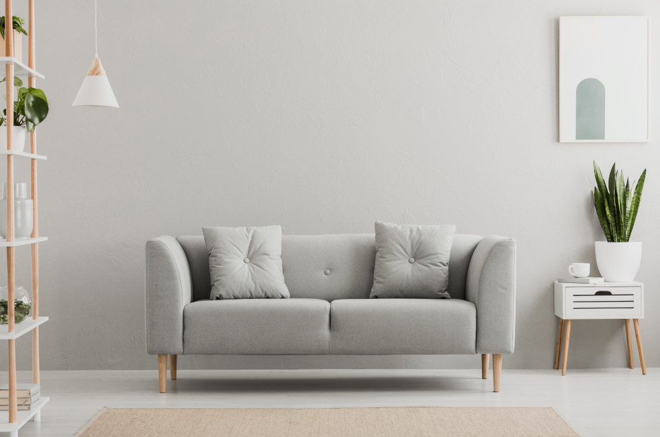
Choosing grey flooring, paint, or cabinets
If you bought into the Mrs Hinch grey trend, it’s time to think again.
Loren advised: “Grey is not a natural colour especially for flooring.
“Grey tones are passe and cold. Try a toned natural matte white oak.”
Using white kitchen cabinets
When it comes to the colour of your kitchen cabinets, Loren wasn’t afraid to hold back.
He shared: “White kitchen cabinets are overused and basic.
Kelly Hoppen’s Luxury Design Tips on a Budget
INTERIOR design guru Kelly Hoppen knows how to create plush living spaces.
The former Dragons’ Den star has worked with celebs including the Beckhams and has created glam interiors for hotels and superyachts. But she also loves a bargain and says there are ways of adding luxury to your space without breaking the bank.
This is no doubt music to the ears of the one in three homeowners planning to renovate interiors this year.
“Luxury isn’t about how much you spend, it’s about how you feel,” she says.
“It can be very easy and affordable to add a touch of luxury and comfort to your home. It’s all about finding different ways of looking at things.”
Here, Kelly gives Emma Lazenby her brilliant tricks for making your pad more plush.
Place it down
RUGS are a brilliant place to start if you want to quickly change a space. A great way to have fun with them and add texture is to also layer two together.
You might already have rugs that are either too big or too small, but layering can put them to better use. When I was styling Boy George’s house, I placed one rug over another, slightly to the right, and it instantly gave an eclectic feel.
People sometimes panic about rugs, but layering makes it easy to adapt them to your space.
Pad it out
CUSHIONS are fantastic if they are positioned well. It’s common for people to put them across the back of the sofa – left, right and in the middle.
But one of the ways I’ve used cushions in my new home is to put them against the side of each sofa arm instead. It creates a completely different look.
It’s also quite nice as an arm rest when you sit down.
I’ve tried putting a smaller, flatter cushion in a different colour on top of a larger one, which works really well too.
Turn books into art
BOOKSHELVES and bookcases can be arranged in a cool way by taking the books that you don’t really need or want to look at – we all have those – and turning them the other way around so you see the paper and not the spine.
Then you can pile them up at different heights and place accessories on top. It can create a really artistic-looking space.
And if you have ten or so random books that happen to be the same colour, you can turn those to have their spines facing, piling them horizontally and placing them between the paper-facing piles.
Get a wonderwall
IF you are renting your home and cannot paint or wallpaper your walls, or if you do not want to commit to anything permanent, buy a large MDF sheet, wallpaper it and put it up against a wall.
This would not be the whole size of the wall, but you could have it in the centre and push it up against the wall with your chair or sofa to keep it in place.
It then means you have a whole new backdrop with a different texture.
You could move it to another room if you wanted to, or even paint it a different colour as the seasons change.
Mix it up with marble
THERE are some amazing tiles out there right now and you can get cheap marble off-cuts that work really well for creating both kitchen and bathroom splash-backs.
My top tip here is to mix marble with more matte tiles so you can play around more with patterns. Just make sure you stick to the same colour tone.
Make a splash
WHEN you move into a new place, it is often the kitchen that can feel a bit icky, with dated walls and tiles. But a really good and easy way to freshen up the space is putting up a metal splashback panel over the oven.
You can get these in stainless steel or even bronze. They are easy to keep clean, create a different texture and reflect light around the kitchen.
Stack it up
ANOTHER trick with books is to stack them on your floor against a wall. If you are like me and you have a lot of them, but not many bookcases, you can pile them up neatly, with the bigger ones at the bottom and the smaller ones at the top.
I’ve grouped together books of similar colours and every so often I will put a little sculpture on top, which gives an artistic look.
The large ceramic vase from my new M\&S home design range (£29.50) would work perfectly here.
This is also a very cool way to create a small table next to a chair or sofa if you can’t afford to get a new piece of furniture. Just place a dish or similar on top and it looks really cute.
“Try a soft white that isn’t too yellow instead if you want a fresh clean look for paint grade cabinets, and a natural wood tone if you prefer stain grade.”
Selecting rugs that are too small for your space
And if you’ve got a tiny rug in your bedroom, prepare to be attacked.
According to Loren: “Your area rugs should be large enough to fit all of your furniture. Avoid wall to wall carpet as well.”
Buying anything fake
When it comes to the materials in your home, Loren is set against fakes.
He recommended: “Generally, I discourage the use of fake materials like Luxury Vinyl Planks and stone look porcelain counters and tiles. Natural is always better.”
Using overly literal design themes
If you want your home to impress, Loren shared the importance of avoiding too many designs.
Interior Design expert advice
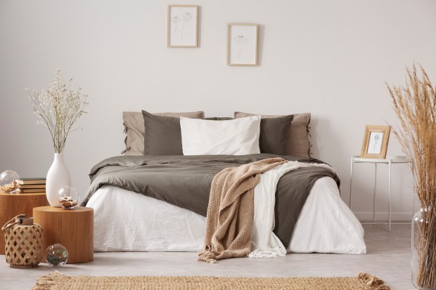
The interior pro highlighted: “Following trends too literally makes a home a caricature and not a reflection of your own personality. Design with meaning.”
Painting prior to testing colours
For those looking to give their home a refresh with a lick of paint, you’ll want to take Loren’s advice.
He claimed: “One of the most common mistakes people make when designing their home is not testing colours prior to painting.
Trends interior designers hate
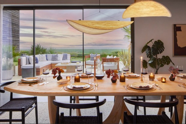
IF you want to ensure that your home looks glam, here are the trends that interior designers can’t stand.
NO YELLOW: According to Bilal Rehman, yellow paint in a bedroom is a big no no.
He said: “If you want everyone to know you’re a horse girl then yellow is perfect for you.”
SIGN OFF: Kelly Hoppen shared her honest thoughts on Live, Love, Laugh signs.
The interior pro explained: “Another gripe of mine – Live, Laugh, Love – those kinds of wooden things that sit on book shelves and floating shelves, that’s so 10, 12, 15 years ago.”
NO GREY YAY: Julie Provenzano explained that grey interiors have been overdone.
She stressed: “We took a good thing and we overdid it to the point that it now feels copy, paste, basic.”
“Colours look different in every light. You should test multiple colours on your wall prior to painting.”
Having a random accent wall
Not only this, but Loren got candid on accent walls, as he snapped: “Accent walls generally feel incoherent and forced.”
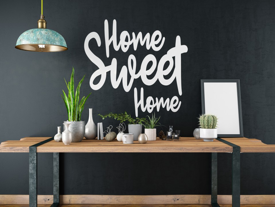
Using decorative letters and signs
Similarly, Loren shared his candid thoughts on decorative signs, so look away if you’ve got ‘Live, Love, Laugh’ in your kitchen.
The pro slammed: “Decorative letters and signs are too literal and, frankly, cheesy.”
Buying labels and logos
As well as this, Loren claimed that logos and designer labels should be avoided at all costs.
He stressed: “Labels and logos are questionable in fashion and shouldn’t be in your home. There’s no need to promote a brand in your house.”
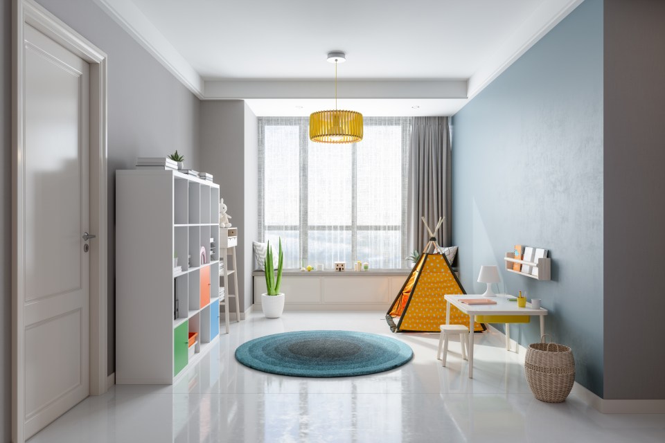
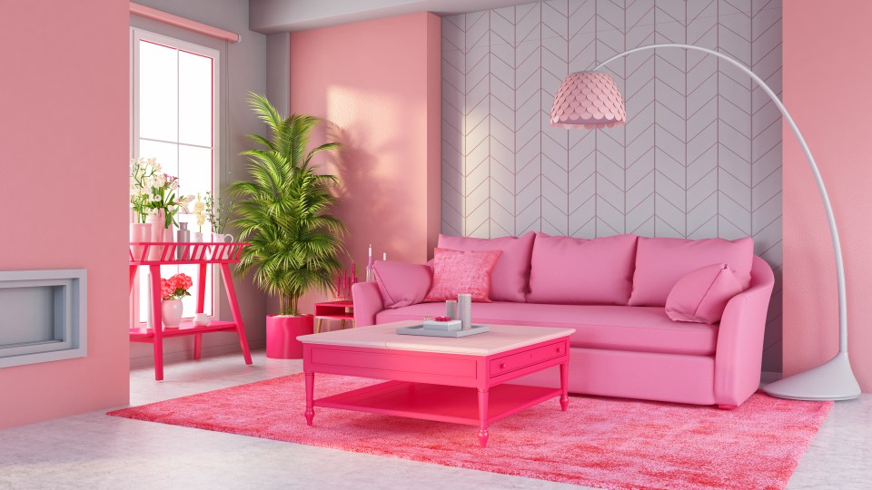
Using bold colours and patterns
Finally, for those debating the maximalist trend, Loren revealed his thoughts.
He concluded: “It takes great expertise and care to pull off bold colours and patterns.
“It’s very easy to make a mess out of your home if you aren’t a pro.”
BIG DIVIDE
Loren’s TikTok clip, which was posted on his official TikTok account @lorenkreiss, has clearly left many open-mouthed, as it has quickly amassed 48,700 views.
If bold colours are wrong I don’t wanna be right
TikTok user
But social media users were left totally divided by Loren’s claims – whilst many were offended by his thoughts, others couldn’t agree more.
One person said: “White Kitchen cabinets are always in style. As a Designer in LA that is what I order for my clients the most.”
Agree with them all
TikTok user
Another added: “If bold colours are wrong I don’t wanna be right.”
A third commented: “I love moody bold colours and patterns. It’s unique and you can appreciate someone leaning into their style if that’s what they love.”
However, at the same time, one DIY fan expressed: “Love and agree with everything you post!”
A second simply wrote: “Agreed!”
Whilst someone else beamed: “Agree with them all.”

