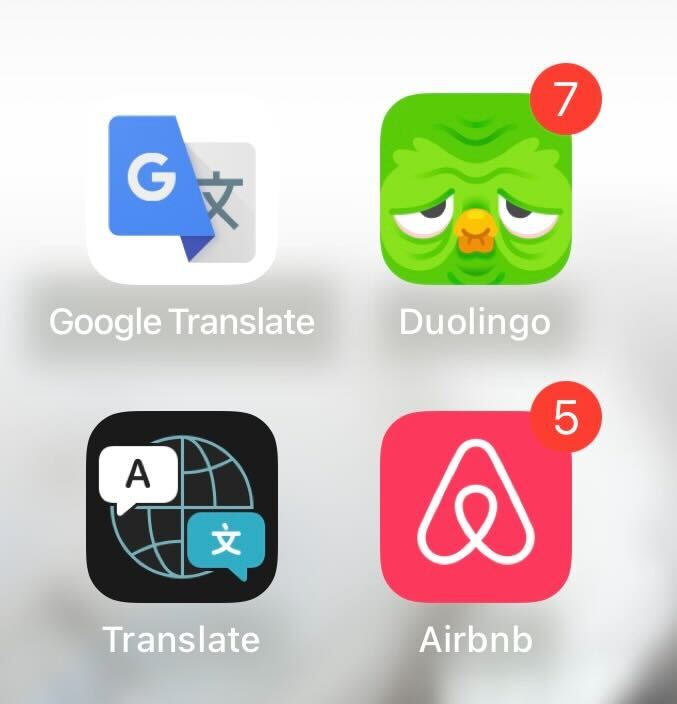
The popular language learning app’s green owl usually sports a cheery expression.
But for some reason the icon that appears on iPhone and Android has dramatically transformed for the worst.
“This does not motivate me,” one user wrote on Reddit.
“It makes me want to delete the app so I don’t have to look at the depressing icon,” another complained.
“I’ve done my lesson today and duo still looks utterly miserable.”
Why does Duolingo look sad?
Duolingo hasn’t revealed the exact reason why the app’s icon has changed to look so sad.
The company did post a cryptic meme about it on X / Twitter, with the caption “when you put off your lesson for 5 mins”.
It is thought that the change may be a trick to grab people’s attention and make them open the app.
Duolingo has tried this stunt before, previously showing the icon with a melted face.
Latest tips and tricks for social media apps
Social media apps like Facebook, TikTok and WhatsApp have become vastly popular – but are always hiding new features or leading viral trends. So here are some of the best things to know…
