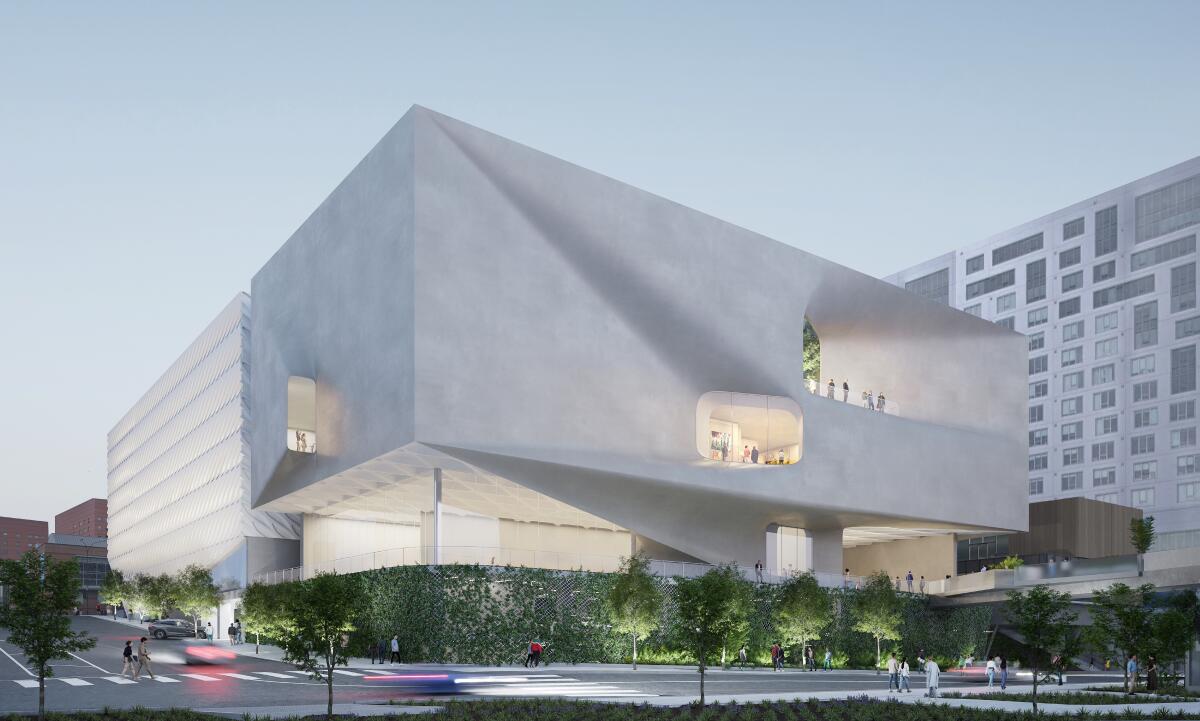
The popular downtown vanity museum on Grand Avenue that opened just over eight years ago has already been deemed too small by its leadership. On Wednesday, Broad founding director Joanne Heyler announced that $100 million will be spent on a three-story, 55,000-square-foot addition at the back of the existing museum structure.
Galleries for the private collection, strongest in 1960s Pop art and its descendants, ranging from Jasper Johns, Ed Ruscha and Roy Lichtenstein to Jeff Koons, Damien Hirst and Takashi Murakami, will occupy roughly 35,000 square feet of that. The collection was assembled by L.A. patrons Edythe and the late Eli Broad over the course of half a century, although works are still being added. Total gallery space for the 2,000-piece collection will increase to around 85,000 square feet.

(Courtesy of the Broad / Diller Scofidio + Renfro)
For comparison, the new David Geffen Galleries under construction at the Los Angeles County Museum of Art in Mid-Wilshire will offer just under 110,000 square feet. LACMA’s collections are global and span thousands of years. The Broad’s are primarily American and largely date from World War II to the present.
Still, the larger Broad space will increase the number of works on view by a relatively modest amount. From 200 to 225 paintings and sculptures now, a 70% increase projected by officials brings the number to more than 350. That’s not a lot for a $100-million expenditure — a pricey $600,000 or more per added object.
The hefty sum also makes one fervently wish the Broad would stop charging admission for special exhibitions. The collection is free to see, but special exhibitions are not.

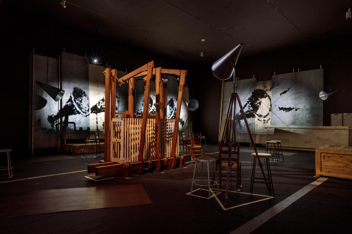
William Kentridge’s installation “The Refusal of Time” was at the Broad in 2022, part of an exhibit for which the museum charged admission.
(Joshua White / The Broad)
Some excellent shows have been done, most notably the knockout 2022 survey of South African artist William Kentridge. Did a $22 premium for adults really need to be charged to defray costs on what was surely an expensive Kentridge presentation? Forbes lists the Broad family’s current net worth at $7 billion. A white artist incisively grappling with apartheid and race at home made for a certainly timely exhibition, given pressing issues in the United States now. Opening it to everyone regardless of ability to pay would have been welcome.
The added space in the expansion seems more about creating room inside the building for people. A long line out front is a common sight along Grand Avenue. (When the Museum of Contemporary Art across the street dropped its entry fees, numbers grew there too.) Attendance is more than triple early projections. A bigger building should accommodate the growth.
The other primary plus is the likelihood of flexibility in the galleries. Much to-do was made at the Broad’s debut over the football-size expanse of column-free space on the third floor, where the permanent collection is shown, with lovely natural illumination diffused from a vast skylight. (Temporary exhibitions are on the first floor, and collection storage is on the second floor.) Galleries, it was said, could be tailored to best suit changing installations of art.
Surely it looked good on paper. In practice, however, things haven’t worked out that way. The gallery layout, with slight exceptions, has been virtually unchanged since opening day.

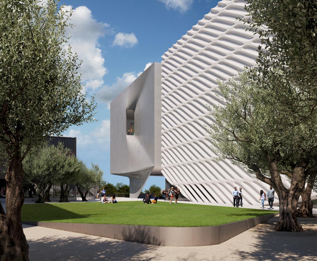
A rendering shows the patterned exterior of the existing Broad where it will meet the flat white expanse of the addition behind it.
(Courtesy of the Broad / Diller Scofidio + Renfro)
One reason might be cost, since strict earthquake codes make erecting temporary walls expensive. At least as likely: A new build-out would require closure for several weeks of much of the third floor, dropping the art on view by a considerable amount. That wouldn’t be too appealing for all those visitors lined up out front. A separate new addition with multiple floors of gallery space fixes that problem.
Another plus: Initial digital renderings from the expansion’s architects, Diller Scofidio + Renfro, show no honeycomb panels made of fiberglass-reinforced concrete on the building’s exterior. Complicated to fabricate and install (the office of Frank Gehry, architect of Disney Hall next door, helped solve some of the thorny design issues), the exterior’s white surfaces seem to magnetize urban grime and are not easy to keep clean. The conceit of a vanity museum’s design being dubbed “the veil and the vault,” with a perforated exterior draped over a treasury for a private collection being made public, was always more pretentious than meaningful. It’s good to see it go.
